Table of Content
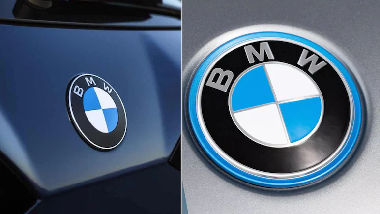
▼The Munich Motor Show witnessed something more than just the launch of the all-electric BMW iX3 — the German automaker quietly introduced an updated version of its iconic BMW roundel logo. While the spotlight was firmly on BMW’s Neue Klasse design language and fresh styling cues, eagle-eyed enthusiasts noticed subtle but significant changes to the brand’s emblem.
Unlike bold redesigns from other automakers, BMW opted for an evolutionary shift in its identity — enhancing the modern aesthetic while retaining heritage appeal.
What Changed in the New BMW Logo?
At first glance, the updated logo looks nearly identical to the outgoing one. However, closer inspection reveals several differences that mark BMW’s refreshed brand philosophy.
- No Inner Chrome Ring: The separating chrome band inside the roundel has been eliminated.
- Simplified Blue-White Division: The horizontal and vertical chrome bars that divided the blue and white quadrants are gone.
- Smoked Chrome Finish: The remaining chrome now appears with a smoked or darker look, adding a modern vibe.
- Matte Black Background: The black section of the logo has shifted to a satin/matte finish instead of gloss.
- Narrower BMW Lettering: The “BMW” letters on the badge appear more slender and refined.
- No Blue Outer Rim: Unlike other BMW EVs (e.g., iX1), the iX3 badge skips the outer blue rim, signaling cleaner and more premium aesthetics.
The iX3 – The First BMW to Wear the New Logo
The iX3 electric SUV has become the first production car to feature this updated roundel. The badge’s subtle tweaks align perfectly with BMW’s upcoming Neue Klasse design language, which emphasizes minimalism, futuristic appeal, and sustainability.
BMW has officially confirmed that the new logo will gradually be rolled out to upcoming refreshed or new models. As a transition strategy, legacy BMWs will continue to carry the older roundel until their redesign cycles.
Visual Comparison – Old vs. New Logo
|
Feature |
Old BMW Logo |
New BMW Logo (iX3 Debut) |
|
Inner Chrome Ring |
Present |
Removed |
|
Division Bars |
Chrome cross-bars dividing blue-white areas |
No division bars, cleaner finish |
|
Chrome Shade |
Bright chrome |
Smoked chrome |
|
Black Section |
Gloss black |
Matte/Satin black |
|
BMW Lettering |
Thicker |
Narrower, sleeker |
|
Outer Blue Rim (EV Models) |
Present (iX1, i4) |
Removed for iX3 |
Why BMW Updated Its Logo
BMW’s decision to evolve rather than radically alter its iconic badge reflects a few key brand strategies:
- Heritage Retained: Preserving its recognizable roundel to maintain continuity with decades of brand history.
- Modern Appeal: Using matte finishes and smoked chrome signals premium quality and modernity.
- Neue Klasse Integration: Aligning the emblem with the futuristic Neue Klasse design philosophy to represent its EV-forward future.
- Minimalism Trend: In line with global branding trends, logos are becoming flatter, simpler, and more digitally adaptable.
The Bigger Picture – Neue Klasse and BMW Identity
While the iX3 launch focused on design updates such as a reshaped grille, sharper LED headlights, and interior tech innovations, the logo update complements BMW’s next chapter in mobility.
The Neue Klasse platform is set to underpin BMW’s future range of fully electric vehicles starting in the coming years. By debuting a refreshed badge now, BMW is synchronizing its corporate identity with its product evolution.
Conclusion
The debut of the new BMW logo on the iX3 might seem like a small detail, but it is a carefully calculated move aligning tradition with future ambition. While the differences are subtle — no chrome inner ring, slimmer letters, matte finish — they represent BMW’s determination to stay modern, minimal, and distinctly premium in the EV era.
Read Also This |
|
|---|---|
Neha Mehlawat
Neha Mehlawat is an automotive journalist and industry analyst with 10+ years of experience covering cars, bikes, and mobility trends. She tracks the latest launches, technology upgrades, and policy changes in the auto sector, delivering sharp insights that help readers stay ahead in the fast-evolving world of automobiles.
 (1)_1783591431.webp)
_1783589591.webp)